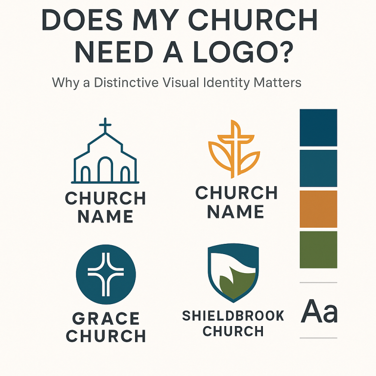
Does My Church Need a Logo? Why a Distinctive Visual Identity Matters More Than Ever (2025 Guide)
In recent years, many pastors, ministry leaders, and church communicators have begun asking the same question:
“Does our church really need a logo?”
It’s a fair question—after all, the Church’s mission doesn’t rely on design trends or branding concepts. However, the reality is that we live in an era where visual identity significantly influences engagement, particularly for new families exploring faith, individuals searching online for a church home, and community members seeking to understand who you are before visiting.
A logo is not your church’s message.
A logo is not your doctrine.
A logo is not your mission.
But a logo does help people recognize, remember, and connect with your church.
In 2025, it’s one of the most essential tools for communication and outreach, a simple mark that helps your ministry make a strong first impression.
Below is a deep dive into why every church needs a distinctive logo, what makes a meaningfully designed one stand out, and how avoiding generic design can strengthen your identity and mission.
Why Your Church Absolutely Needs a Logo in 2025
1. Your Logo Is Your First Impression
Before anyone hears your sermon, meets your pastor, or walks through the doors, they see your:
website
social media
signage
livestream thumbnail
printed materials
event flyers
outreach banners
In each of these spaces, your logo is the visual handshake that introduces your church to the world.
A clear, modern, well-designed logo signals:
“We care about excellence.”
“We pay attention to details.”
“We value communication.”
“We are active and engaged.”
A logo becomes a ministry tool when it helps remove obstacles that might keep someone from visiting.
2. Logos Build Trust and Recognition
Churches thrive when people feel connected.
A memorable logo helps build that connection through recognition.
Think of trusted ministries, nonprofits, or even denominations—you can probably picture their logo instantly. That visual consistency builds familiarity, and familiarity builds trust.
When your logo is stable and recognizable, it:
Helps people identify your church on social media
Strengthens outreach and advertising
Supports local community presence
Helps visitors feel like they already “know” you
This matters deeply for families exploring new churches, newcomers in your area, and people not yet comfortable attending in person.
Why Your Logo Should Stand Out—Not Blend In
Here’s the truth almost nobody says out loud:
Most church logos look exactly the same.
They often include one or more of these:
There’s nothing inherently wrong with these symbols—they hold rich meaning.
However, when used without intentional design, they become generic, forgettable, and indistinguishable from the church down the street.
In a digital world oversaturated with content, a copy-and-paste logo does not effectively support your mission.
Distinctive branding doesn’t make your church “trendy”—
It makes your church clear, memorable, and recognizable.
What Makes a Strong Church Logo? (A Practical Checklist)
A good church logo strikes a balance between meaning and simplicity. Here’s what matters most:
1. Simplicity
It should be easy to recognize at a glance. Think Apple, Nike, FedEx—simple, clean, timeless.
2. Scalability
Your logo must work on:
a tiny favicon
a large outdoor banner
T-shirts
screen graphics
printed materials
If it becomes muddy when resized, it’s ineffective.
3. Versatility
Your logo needs different versions:
landscape version
stacked version
icon-only version
black/white version
one-color version
full-color version
This allows you to use it across all communication channels.
4. Alignment With Your Identity
A strong church logo visually reflects:
your mission
your culture
your community
your story
your vision
You are not like every other church—your logo shouldn’t be either.
5. Strong Typography
The typeface communicates personality. Clean, modern typography helps your church feel accessible and welcoming.
6. Longevity
Your logo should last 7–10 years without needing an overhaul.
Why Churches Often Get Logos Wrong
Many churches fall into one of these traps:
Using DIY logo makers
Copying a design from another church
Choosing random clipart
Making something symbolic but visually cluttered
Letting multiple people guide the design (design by committee rarely works)
Using old-fashioned fonts or outdated shapes
Not considering how the logo will be used across platforms
The result is usually a logo that feels inconsistent, confusing, generic, or visually weak.
Your church deserves better.
A Strong Logo Supports Your Mission—Not Replaces It
Some leaders worry that branding overemphasizes image.
But good branding doesn’t distract from the Gospel—it helps communicate it clearly.
A thoughtful logo:
Your logo isn’t your church.
However, it does help people find your church, remember it, and trust it.
How Service Ministries Can Help
Service Ministries specializes in creating distinctive, meaningful, ministry-focused logo systems that reflect the heart of your church. Our process is designed for churches of all sizes and budgets and includes:
full logo design
brand color palette development
typography recommendations
icon variations
social media profile graphics
signage-ready files
brand guidelines document
We don’t do cookie-cutter logos—your church deserves a brand that reflects your calling, not a stock icon.
Final Thoughts
Your church doesn’t need a flashy brand. It doesn’t need something trendy or over-designed.
But it does need a clear, memorable, meaningful logo that helps people connect with your mission.
A strong logo isn’t about marketing—it’s about ministry. It helps people recognize your presence, understand your identity, and feel confident walking through your doors.
In 2025 and beyond, a distinctive logo is one of the simplest, most powerful communication tools your church can invest in.